The Mark
$450
flat
2 weeks
Logo + wordmark, color palette, one-page brand sheet.
Built for
“I need to stop using Comic Sans.”

Whitestone Design · Omaha
Services
Logo + wordmark, color palette, one-page brand sheet.
“I need to stop using Comic Sans.”
Everything in The Mark + full design system: fonts, tokens, social templates, business card & letterhead, usage guide.
“I want to look established.”
Everything in The Full Kit + a launched one-page website.
“I want to be findable and look established.”
Need it sooner? Ask me.
Portfolio
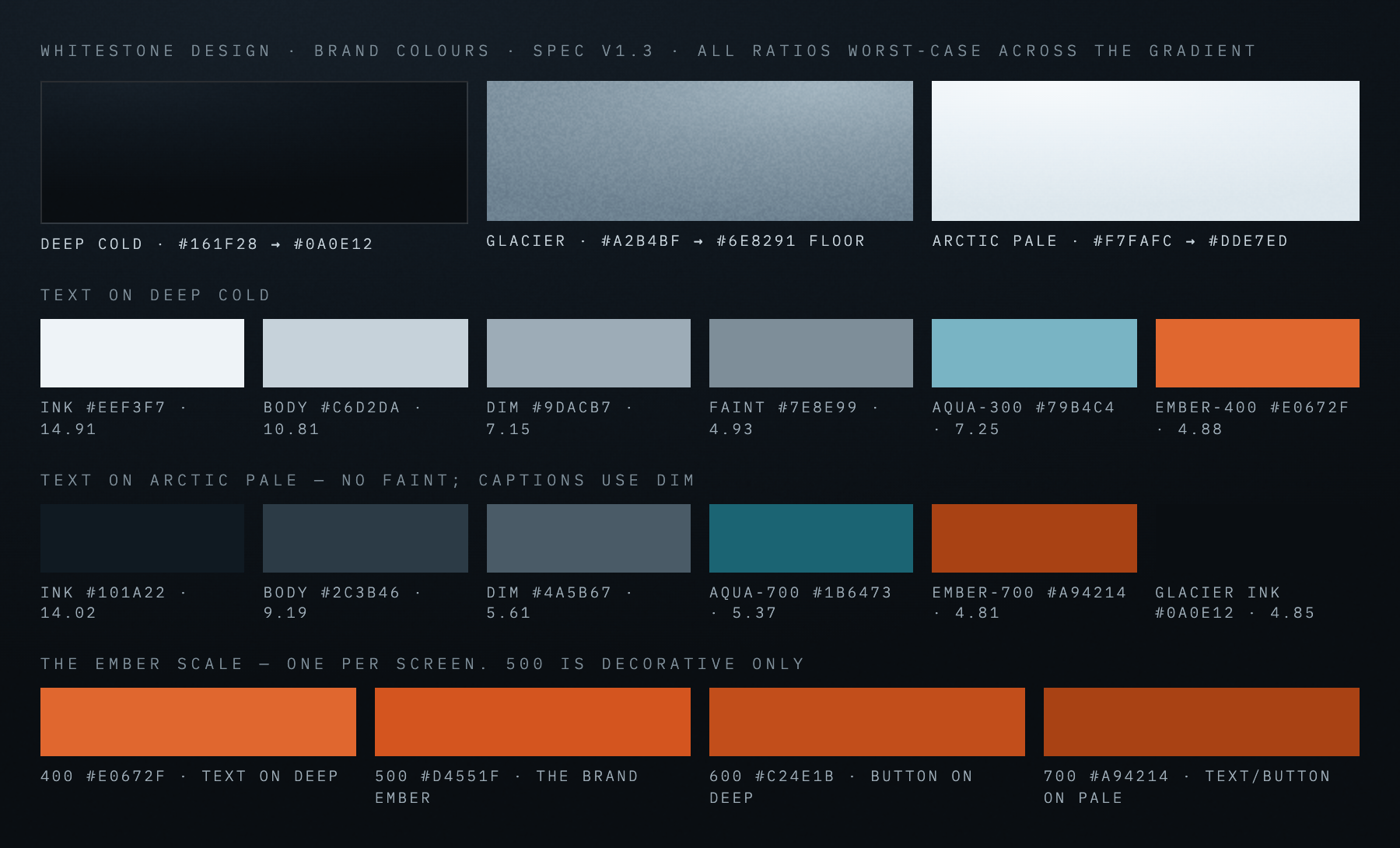
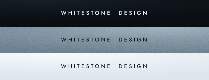
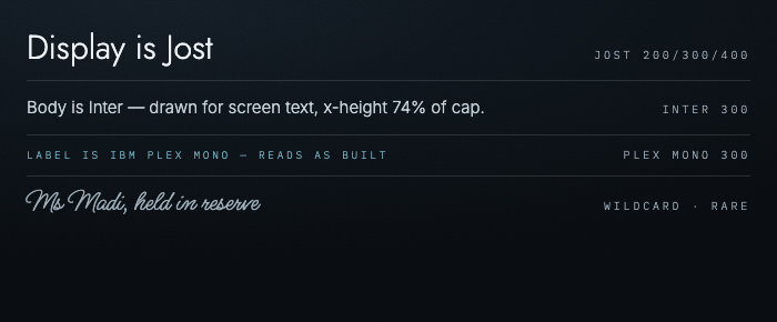
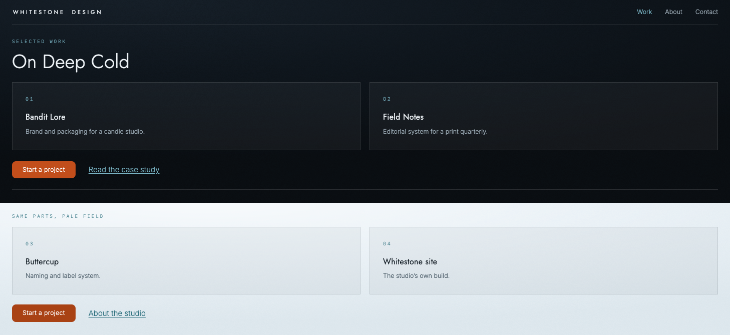
The studio's own brand, built before anyone else's. A wordmark in place of a logo, a cold palette with one warm ember, four typefaces with one job each, and a written rule for every decision. Then the working parts: navigation, cards, buttons and links, every contrast measured. It was built with the same care every client's brand gets.
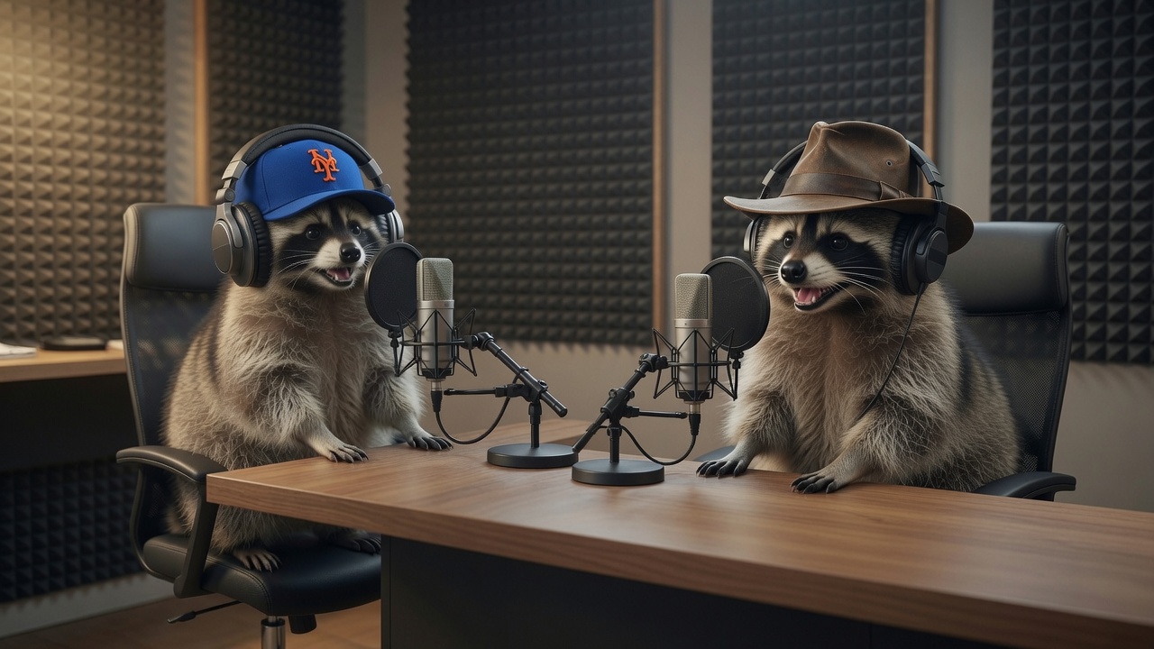
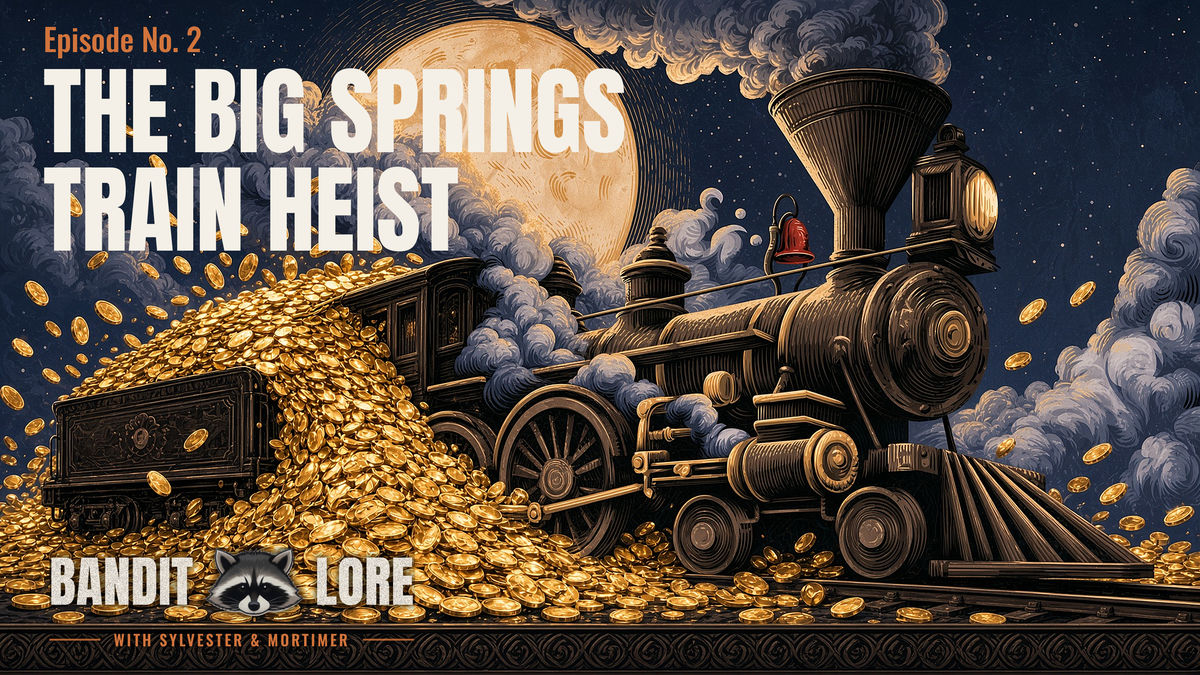
One brand, every surface. The show identity, the editorial host cards, the characters themselves and the campaign art for each episode all come from the same system, and it has held together through months of weekly publishing. The show also has a website, designed and shipped: banditlore.com.

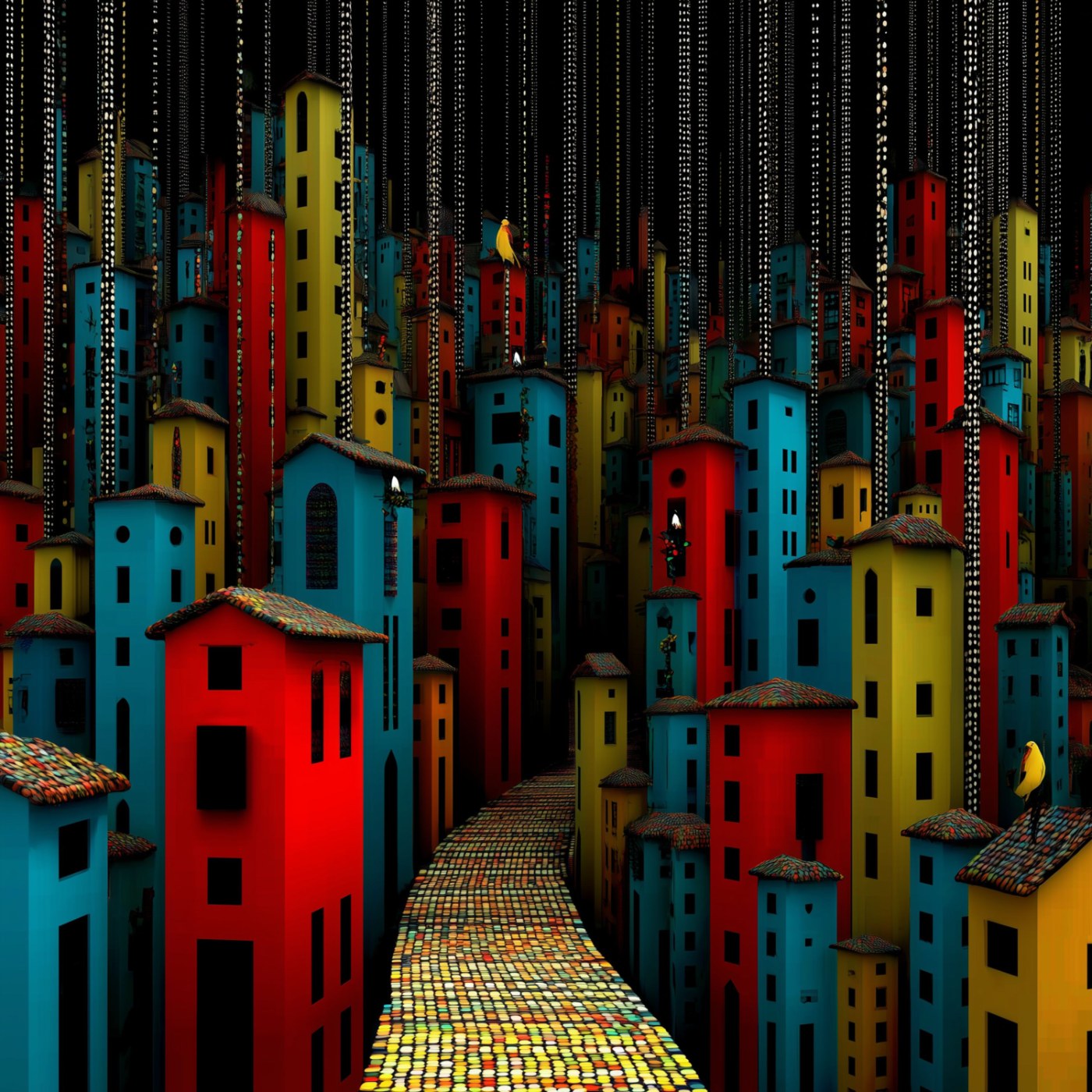
Every single from the album wears the same painting of red, colorful houses, shifted slightly with each release. Each cover stands on its own. When the run is done, the album cover becomes the houses, and the singles turn out to have been pieces of it all along: a series jacket, delivered in installments.